 [social_warfare]
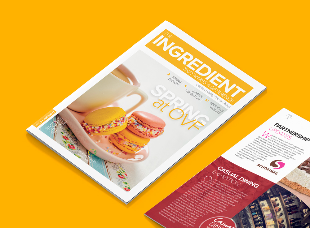
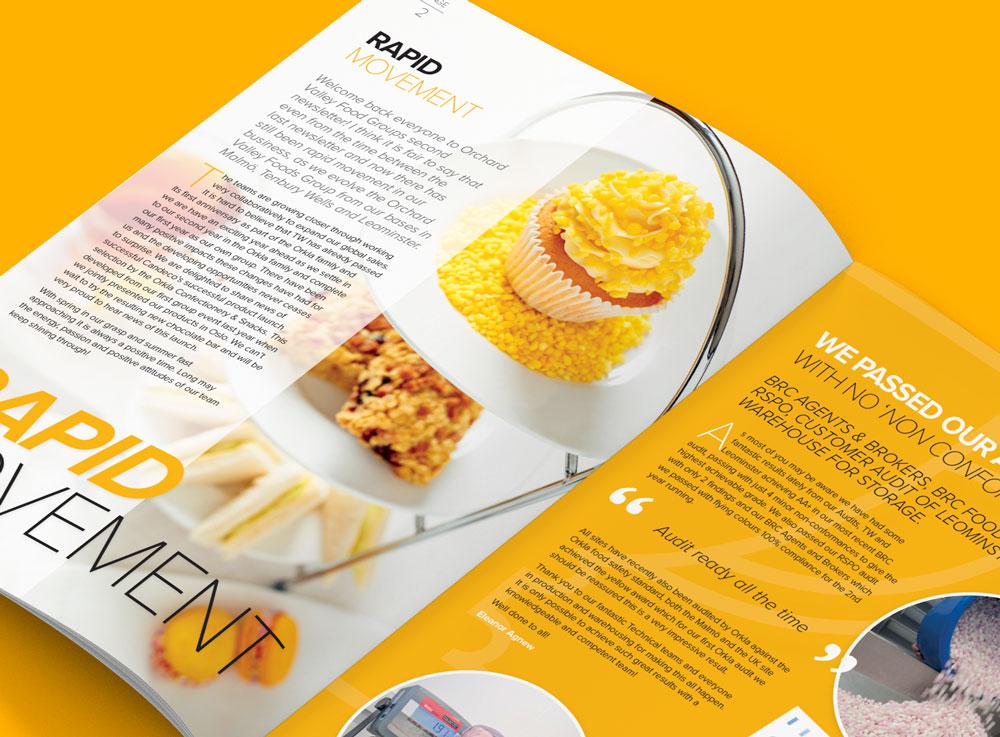
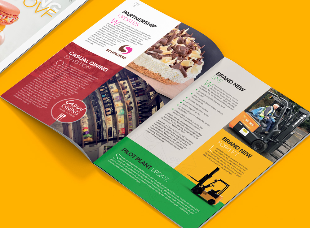
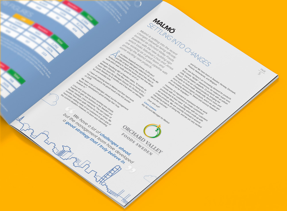
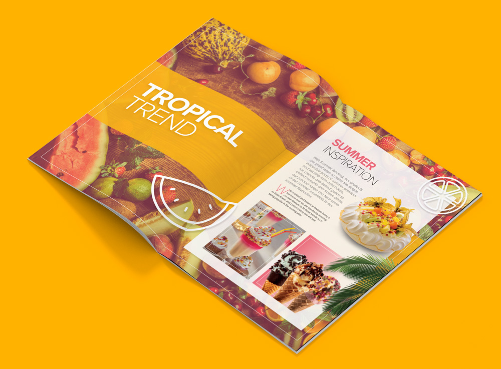
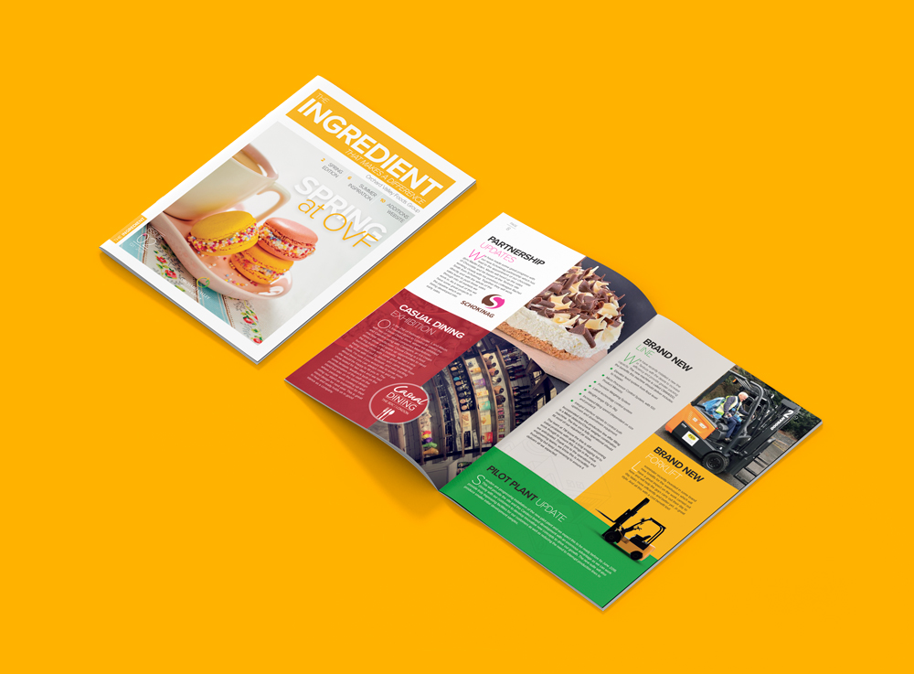
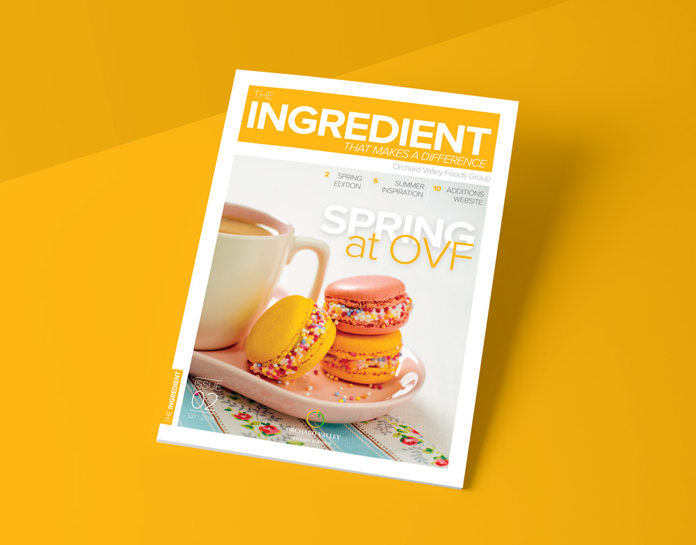
 We recently designed the first ever edition of Orchard Valley Food’s internal magazine: The Ingredient That Makes The Difference. With the second issue (Q1 2018) we followed the same layout style from the first edition; modular blocks of colour paired with a wide range of images. The content of the second issue updates the company’s employees about all the recent events and developments since the previous edition just before Christmas. The articles vary in size from a couple of paragraphs to full page spreads. Each article is accompanied by relevant imagery, whether it’s company photos, illustrations or product images.
Design: We drew inspiration from Scandinavian minimalism; the styling of the magazine is clean and simple and makes use of white space contrasted with the strong brand colours of Orchard Valley Foods. The use of contrast is replicated throughout the publication with bold fonts paired with light fonts.
Orchard Valley Foods manufacture confections, decorations and inclusions, which enhance desserts, ice creams, cakes, muffins, tray bakes, doughnuts, cookies and beverages. This meant we had an attractive selection of images and colours to make use of throughout the magazine.
We look forward to working on next quarter’s issue. You can find out more about Orchard Valley Foods here.