 [social_warfare]
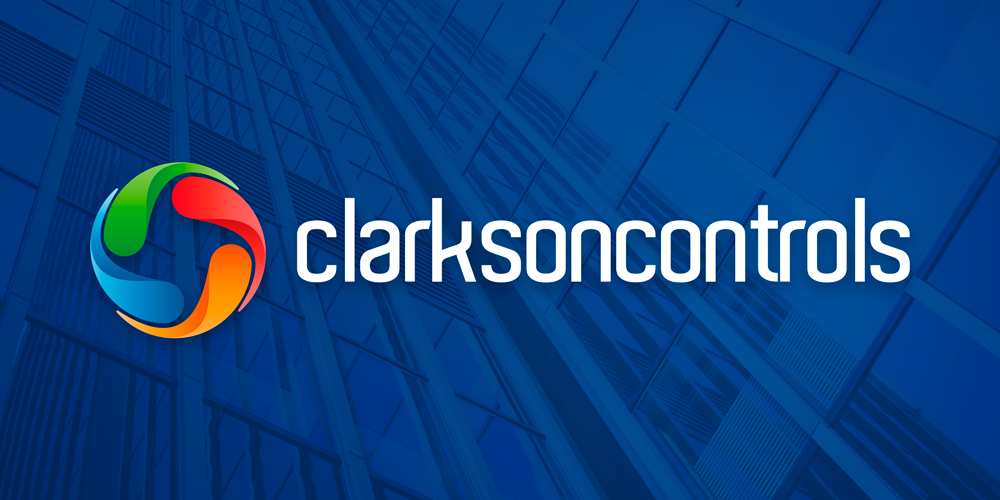
 After 25 Years of being in business, Clarkson Controls decided it was time for an update of their corporate identity. They wanted their new logo to represent what they do; Building Management Systems that control the temperature, ventilation and air flow in a wide array of building setups.
The new corporate identity includes the same typeface as their previous logo however the icon has been updated to reflect their brief. The logo is made up of 4 separate elements that represent each main process of Clarkson Control’s work. Green – Energy efficiency. Blue – Cool, clean air. Orange – Warm, clean air. Red – Warm, clean air. Each of the 4 parts of the icon convey ‘motion’ and when combined together in the circle of the logo come together to create a fan shape within the negative space.
You can find out more about Clarkson Controls here.

![]()
![]()