 [social_warfare]
 Adidas Football World Cup Jerseys
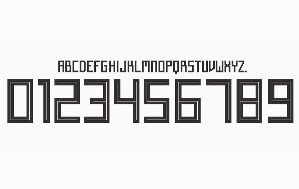
“The official Adidas’ font, used on its FIFA World Cup jerseys, caused a lot of confusion due to its square, Cyrillic-style letters and numbers. Inspired by traditional Soviet imagery, the font uses sharp 90-degree strokes which causes confusion between letters like ‘A’ and ‘R’, ‘X’ and ‘K’, ‘Z’ and ‘2’, etc.
FIFA’s equipment regulations state that the font used on all apparels must be legible and distinguishable by all players, match officials, spectators and the media. Adidas’ font is neither clearly legible or distinguishable as pointed out by Twitter users over the past tournament.”
This perfectly illustrates the problem about this “typeface”.
Thanks, Julian …
OAAXLEA?
DARKLER?
ORAHLEA?
DAAHLER?
ORAXLER?
ORAHLER?
DRAXLER?
OARHLEA?
DAAXLEA?
OAAHLER?
DARXLER?
OARXLEA?
ORAXLER?
DRRXLER?
DRAHLEA?
DRRHLER?
ORAXLEA?
OAAXLER?
ORRHLER?
DARHLEA? pic.twitter.com/YqJIyIpxyw— sportsfonts.com (@sportsfonts_com) March 20, 2018
The font for these Adidas numbers is shocking. 11 or 17 or 77. (Obviously not 77 in the World Cup but still) pic.twitter.com/TyM9D7Rm0k
— Craig Williams (@craigawilliams) June 15, 2018
I get that @adidas were going for a Russian Constructivism vibe, but their #WorldCup typeface feels too clunky and quirky and often illegible. Given their fondness for 80s retro kits this year would they have been better off using this? https://t.co/rvgqmXMB8U @sportsfonts_com
— James Taylor (@jamestaylor) June 20, 2018
Credit to Digital Synopsis.